Layers
MapProvision provides a number of different layers that you can you to represent your spatial data.
Each dataset can represented as one or more of the available layers. When you add
or manage your dataset you can set which layers you would like to use to represent your data set.
Currently MapProvision has the following layers:
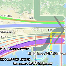 |
 Sankey Map Sankey Map
Sankey diagrams are a type of flow diagram where the width of the arrows are proportional to the volume being described.
MapProvision now offers the ability to create Sankey Maps overlaid on top of a map to show data flows between
geographic locations. This new visualization provides an easy way to understand data flows and
volumes within a geographic context.
The Sankey layer provides a number of interactive tooltips when you mouse over the paths and sourc/target nodes
You can customize the symbology to specify path thickness color, opacity and change the color of the source/target arrows.
| 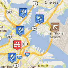 |
 Images Images
The Image layer allows your dataset's values to be represented by your own images which you can upload
using the Image Layer tool. Images can be uploaded and then be used to
form your image set where each image in the image set is represented by a value of your choosing. This way
a dataset's value can be used to show many different images depending on the data point's attribute value.
The images that you upload can be used across the multiple Image Layers that you can define.
If no image is associated with the point's attribute value then the default Google Maps placemark is used.
|
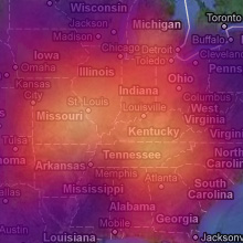 |
 Interpolation Interpolation
The Interpolation layer suits data sets that have their data points spread out in an inconsistent way.
It is designed to interpolate between the data points using gradients to best fit
the data in between the spatial values. It groups the data into grids, the grid size can be set to auto or
you can set a specific grid size that best represents the data set. You can set the type of
aggregation used for all the values in each grid. The aggregation options are minimum, maximum, average and
sum. You can assign multiple aggregation functions to the dataset's attributes which will be
represented as separate layers.
You can alter the colors used to represent each color band that is used to comprise the Interpolation layer.
Every time the layer is displayed the minimum and maximum grid values are calculated based on all the data that
is present in the displayed map. Eleven color bands are used to represent the lowest value 0, the 0-10 spread
(Color Band 1), the 10-20 spread (Color Band 2) all the way up to the maximum value which is 100 (Color Band 11)
which is the grid with the largest aggregated value.
When the Interpolation layer is displayed a legend is also displayed showing the color bands and the values that are
presently assigned to those color bands. Every time the layer is displayed these color bands are recalculated
based on the minimum and maximum grid values that are present in the current map's bounding box.
The interpolation layer also supports animation between two Interpolation layers and you can specify the animation
duration in the symbology settings.
|
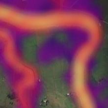 |
 Raster Grid Raster Grid
The Raster Grid layer suits data that is fairly closely packed together. When a Raster Grid layer is selected
all the spatial data visible in the maps bounding box is assigned to a grid. The grid size can be set to auto or
you can set a specific grid size that best represents the data set. You can set the type of
aggregation used for all the values in each grid. The aggregation options are minimum, maximum, average and
sum. You can assign multiple aggregation functions to the dataset's attributes which will be
represented as separate layers.
You can alter the colors used to represent each color band that is used to comprise the Raster Grid layer.
Every time the layer is displayed the minimum and maximum grid values are calculated based on all the data that
is present in the displayed map. Eleven color bands are used to represent the lowest value 0, the 0-10 spread (Color Band 1),
the 10-20 spread (Color Band 2) all the way up to the maximum value which is 100 (Color Band 11) which is the grid with
the largest aggregated value
When the Raster Grid layer is displayed a legend is also displayed showing the color bands and the values that are
presently assigned to those color bands. Every time the layer is displayed these color bands are recalculated
based on the minimum and maximum grid values that are present in the current map's bounding box.
A blur is also used to smooth the gradients transition between the neighboring grids, the blur value can be
set in the symbology settings.
The Raster Grid layer also supports animation between two Raster Grid layers and you can specify the animation
duration in the symbology settings.
|
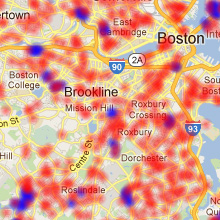 |
 Density Density
The Density layer represents the dataset's values as opaque circular gradients. It can be used to measure the spread of occurrences
of locations where the location's attribute has a value greater than zero.
A color value can be set to represent the layer in the symbology settings. If a value is not set and multiple
Density layers are activated then different color values will be assigned automatically.
You can also set the radius of the density plot and the base opacity to suit the data in the symbology
settings.
The Density layer is designed to show the geographic spread of the data so will only show one plot for each spatial occurrence
in your dataset. So if a point has a value of 20 only one plot will be displayed. If there are 20 points in the dataset at the
same location, then 20 plots will be displayed at that location resulting in a higher opacity of the plot.
When the Density layer is displayed a legend is also displayed showing the color value and size of each of the Density layers that are
activated.
|
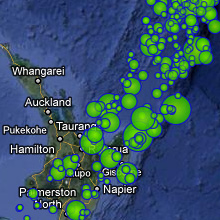 |
 Circles Circles
The Circles layer represents the dataset's values as circles. You can also set the maximum and minimum radius
in the symbology settings. Every time the Circle layer is displayed the minimum and maximum
values are calculated based on all the data that is present in the displayed map. The circles are then assigned
a radius between these two values that is representative of the data point's value.
The circles are represented using a circular gradient between two colors an outer and inner color. The color values can be set
to represent the Circle layer in the symbology settings. If color values are not set and multiple
Circle layers are activated then different color values will be assigned automatically.
You can also specify the opacity and an optional circle outline's stroke color, stroke width and stroke opacity
in the symbology settings.
When you hover the mouse over any of the displayed circles the inner and outer colors are inverted and the circles
value is shown as a hint on the map.
|
 |
 MultiGeometry MultiGeometry
The MultiGeometry layer can be used to represent points, lines and polygons.
Polygons and lines are taken from KML file uploads.
Points, lines, and polygons in a KML layer can be taken from either CSV or KML uploads.
|
|