Symbology
Layer Symbology is the way that the layer types will be rendered in your viewer map portal. Each
layer type has various settings that you can change to suit your preference of how the layer will be
rendered.
When adding or updating datasets you have the option of changing the default symbology
of your dataset's layers. This is optional if you do not alter the symbology when
adding a dataset the default symbology for the layer types will be applied. Changes to symbology
will stay in effect until the symbology is again updated in the Manager.
The Symbology tab allows you to select the Layer Type that you wish to alter the symbology for.
Interpolation Symbology
Color Bands
You can change the colors used to represent each color band that is used to render the Interpolation layer.
When the layer is displayed the minimum and maximum aggregated grid values are calculated based on all the data that
is present in the displayed map. Each grid is assigned a number between 0 and 100 and the color assigned to the grid will be
its position relative to the color bands that it lies between. Eleven color bands are used to represent the lowest value 0,
the 0-10 spread (Color Band 1), the 10-20 spread (Color Band 2) all the way up to the maximum value which is 100 (Color Band 11)
which is the grid with the largest aggregated value.
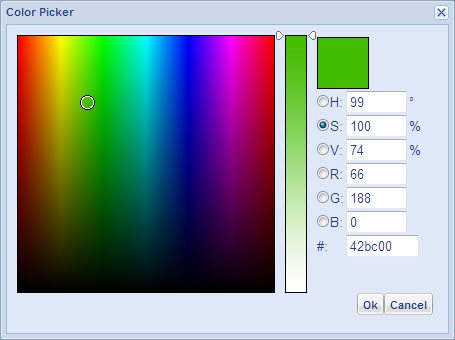
You can click the select button to popup a color picker (shown below) to help choose your desired color.
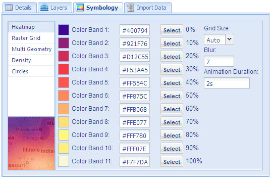
Grid Size
You can set the grid size to a fixed value to be used when the layer is rendered. A grid size of 50 means the data will
be arranged in to a 50x50 grid. Where data is more spaced out you may want to lower the grid size to help ensure the
layer gets enough coverage to reduce gaps. Selecting auto will automatically set a grid size based on the size of the map.
Animation Duration
The Raster Grid are supported by the Animation Generator.
This allows you to create an animation between two layers of the same type.
You can specify the animation duration.
Once the animation has completed it starts again from the beginning.
Raster Grid Symbology
Color Bands
You can change the colors used to represent each color band that is used to render the Raster Grid layer.
When the layer is displayed the minimum and maximum aggregated grid values are calculated based on all the data that
is present in the displayed map. Each grid is assigned a number between 0 and 100 and the color assigned to the grid will be
its position relative to the color bands that it lies between. Eleven color bands are used to represent the lowest value 0,
the 0-10 spread (Color Band 1), the 10-20 spread (Color Band 2) all the way up to the maximum value which is 100 (Color Band 11)
which is the grid with the largest aggregated value.
Grid Size
You can set the grid size to a fixed value to be used when the layer is rendered. A grid size of 50 means the data will
be arranged in to a 50x50 grid. Where data is more spaced out you may want to lower the grid size to help ensure the
layer gets enough coverage to reduce gaps. Selecting auto will automatically set a grid size based on the size of the map.
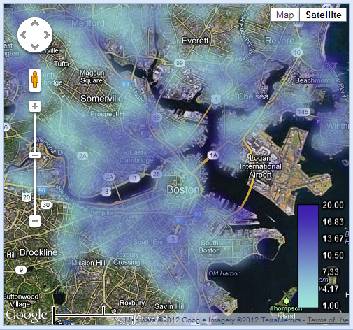
Blur
A blur is used to smooth the gradients transition between the neighboring grid cells, the blur value can be
set in the symbology settings.
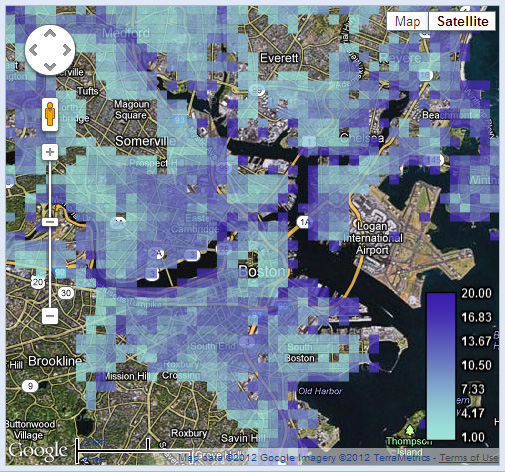
The following screenshot shows the Boston flood model layer with blue color bands and a blur value set to 7:
The following screenshot shows the same Boston flood model layer with the blur value set to 0:
Animation Duration
The Raster Grid layer is supported by the Animation Generator between two Raster Grid layers. You
can specify the animation duration. Once the animation has completed it starts again from the beginning.
Multi Geometry Symbology
The symbology of the MultiGeometry layers needs to be specified within its KML definition.
Density Symbology
In the Manager you can change the layer's symbology by editing it's symbology panel
in the Symbology tab. These changes will stay in effect until the symbology is again updated
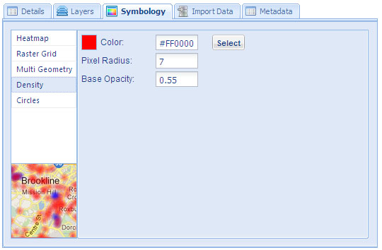
You can set the radius of the density plot and the base opacity to suit the data in the symbology
settings.
Circle Symbology
In the Manager you can change the layer's symbology by editing it's symbology panel
in the Symbology tab. These changes will stay in effect until the symbology is again updated
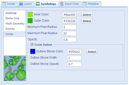
You can set both the inner and outer color to represent the circle layer. If you do not want a color gradient in
the circle you can set both colors to the same value and no gradient will be used.
You can specify the minimum and maximum pixel radius of the circle layer. The values that are being displayed
on the Maps bounding box will use these minimum and maximum values to size the circles based on the
individual plot values. You can also invert the maximum and minimum values so that the minimum radius is
greater than the maximum radius which will cause plots with higher values to be smaller circles.
You can set the base opacity for the circle layer to make the circles more transparent.
You can either specify an outline or no outline by clicking the Circle Outline checkbox. If this checkbox is selected
the symbology options for the outline will be shown. Here you can set the stroke width, opacity and color for the
circle outline.
|