Histogram
In the MapProvision Viewer Visualization tool you can select Histogram from the Visualization drop
down menu. Selecting this will show the dataset attributes that you select in the tree as
histogram visualizations.
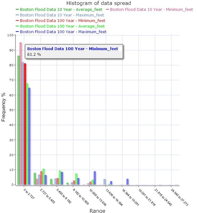
The histogram viewer shows a popup box each time the mouse is hovered over a bar in the graph
to show the exact value for that attribute's spread.
The histogram will graph the selected attributes into ten different value ranges to show the
spread of the data. The bars are color coded and have a legend to show which colors are being used
to show each attribute's range.
|